
We built and developed the Brand Identity for the Borien Education Foundation for South Africa. Since 2004, Befsa has been changing the lives of South Africans living in extreme poverty, through education programs and micro-loans.
At the heart of the brand lies the positioning 'This changes everything'. BEFSA’s work changes everything for those they support. One small intervention—whether it’s providing meals for students so they can focus in school or offering micro-loans to empower women to start businesses—creates ripple effects that transform lives and uplift entire communities. BEFSA offers individuals the chance to rise above their circumstances, defying the statistics and becoming more than what society expects them to be.
We brought this powerful narrative to life through thoughtful design choices.
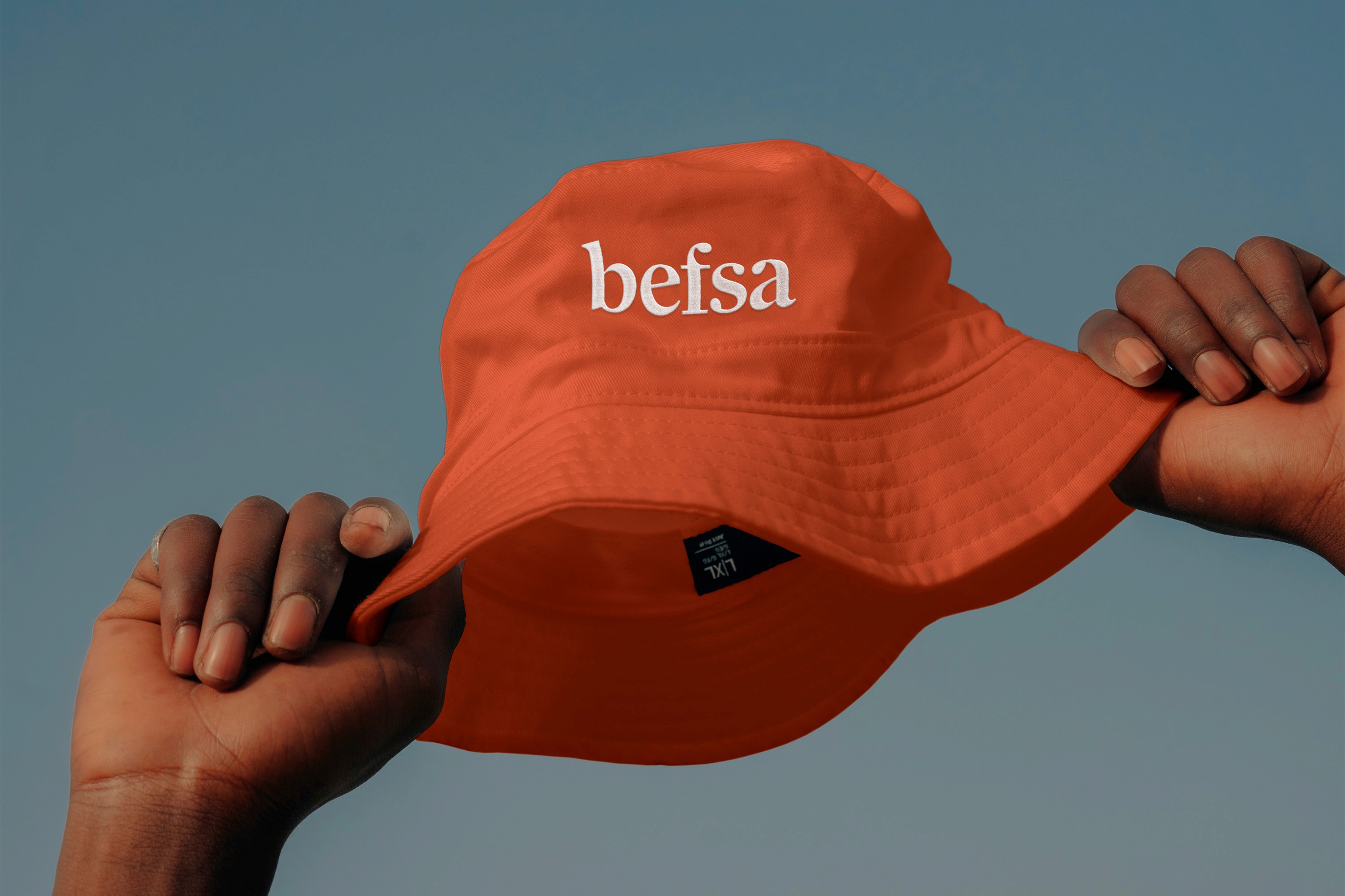
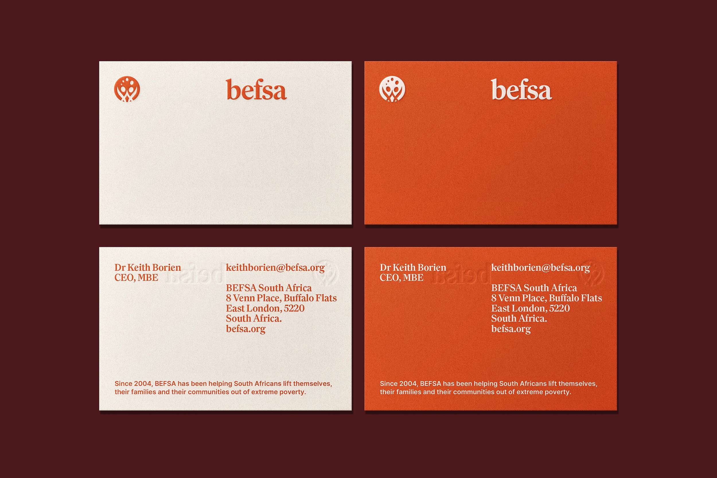
Building on BEFSA’s original logo, we crafted a more refined and versatile brand mark that preserves the essence of togetherness and partnership while ensuring scalability and adaptability across all mediums. We introduced Family by Klim as the primary typeface to infuse warmth and approachability into the brand’s visual language. BEFSA’s signature orange was amplified for the digital landscape, supported by an expanded palette designed for UI and accessibility. Charming, woodcut-style African illustrations enhance the wayfinding and user experience, while authentic photography highlights individuals who embody hope, positivity, and resilience—those who defy the odds and rewrite their own stories.
Together, these elements create a cohesive and distinctive brand identity, providing BEFSA with a platform to expand its reach to a global audience.

